Gallery
Learn how to use specific Closeread features or find some inspiration in our examples.
No matching items
Feature Demos
A series of short Closeread documents that each demonstrate one feature of the Closeread custom format.
| Feature | Description |
|---|---|
| Build up plots |
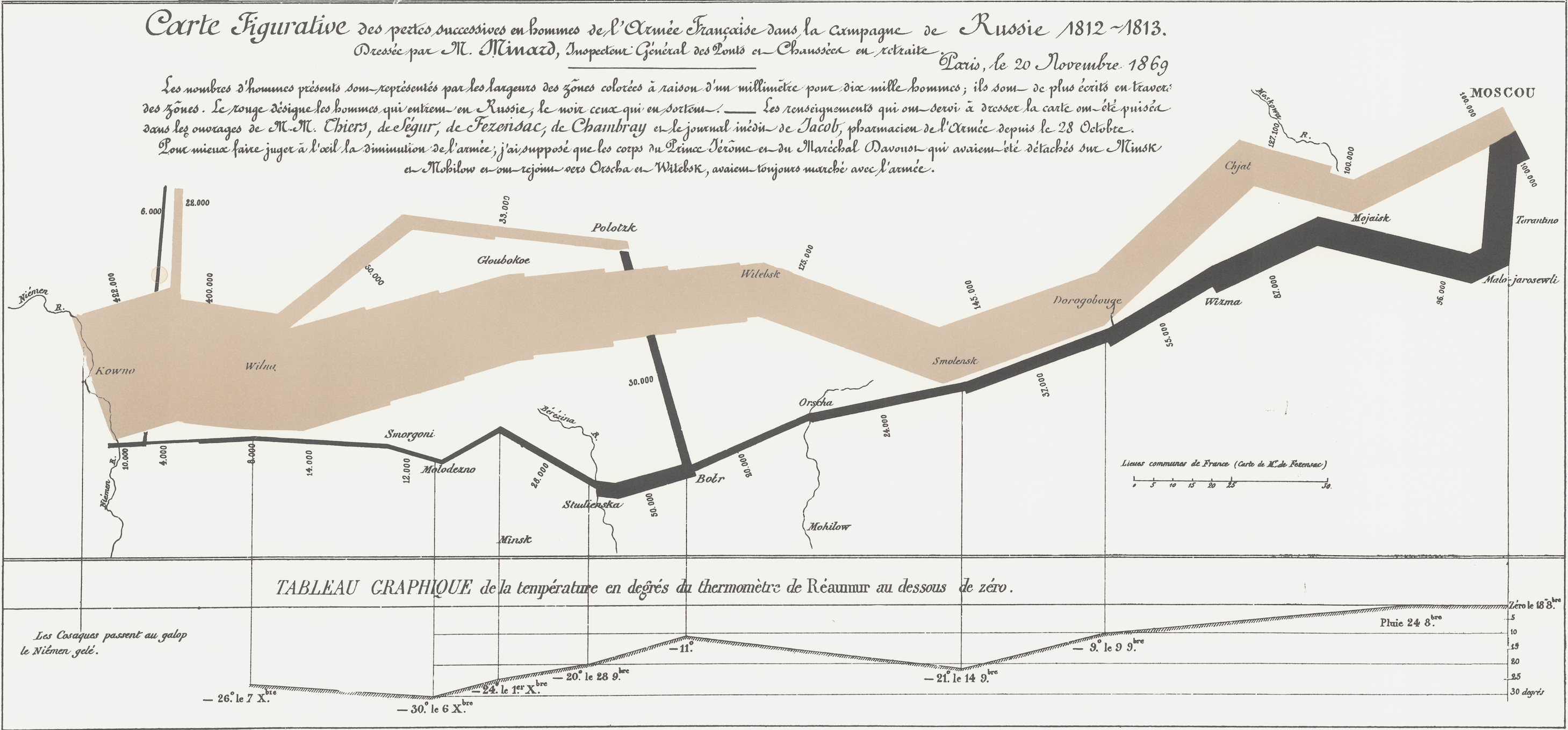
In this demo, we’ll recreate a plot from the documentation of Allison Horst’s {palmerpenguins} R package, which provides access to penguin data from Dr. Kristen Gorman and…
|
| Highlighting | Closeread enables the highlighting of both code and text using a similar syntax. |
| OJS Variables | Closeread makes scrolling progress available to users as Observable JavasScript variables, so you can create Closeread sections with interactive graphics that change as you… |
| Zooming | Closeread enables the reader to zoom in on particular bits of both code and text using a similar syntax to highlighting |
No matching items
Closeread Prize
In November 2024, we put the call out: show us the most amazing things you can do with Closeread!
The Quarto community did not disappoint. 40 amazing entries covered a wide range of topics, from sports data to deep history. Here we feature the most outstanding entries, with links to their source code so you can learn from their expertise.
With so many fantastic entries, Andrew and James had their work cut out for them. They were joined by Curtis Kephart, a data scientist at Posit, Suzannah Lyons, a science journalist at 360info, and Joshua Byrd, a data journalist and developer at the Australian Broadcasting Corporation.
Grand Prize Winner
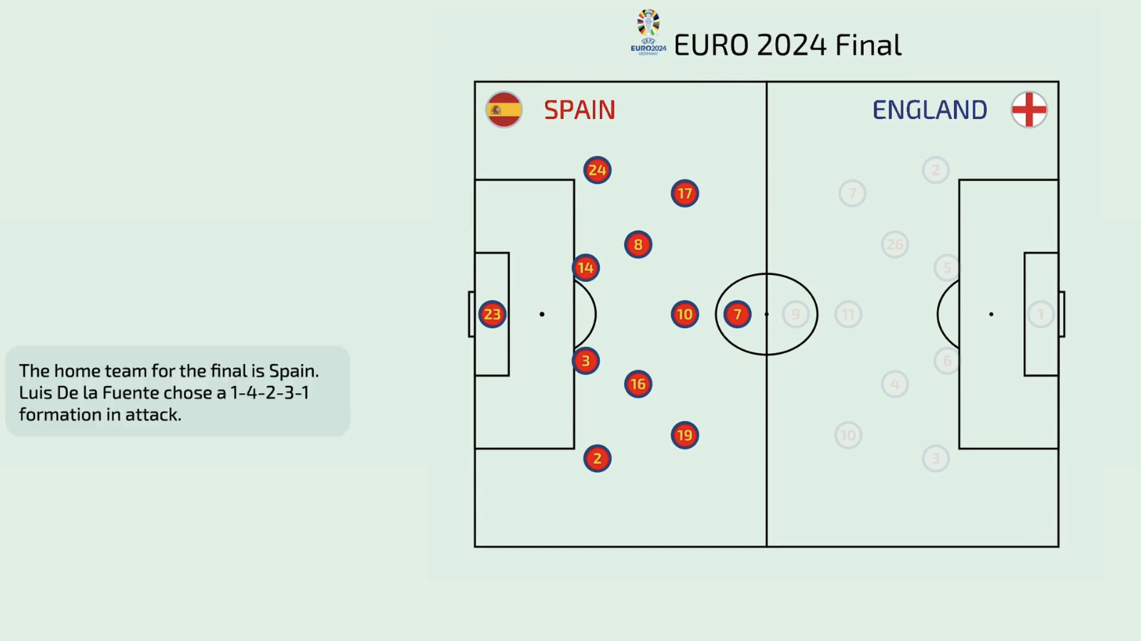
EURO 2024 Final Scrollytelling Analysis
Article | Repo | Submission
James says: “This story customises ggplot2 and ggiraph absolutely flawlessly. It shows just how far Quarto and R’s tools can be pushed with careful consideration of colour and plot elements.”
No matching items
Special Prizes
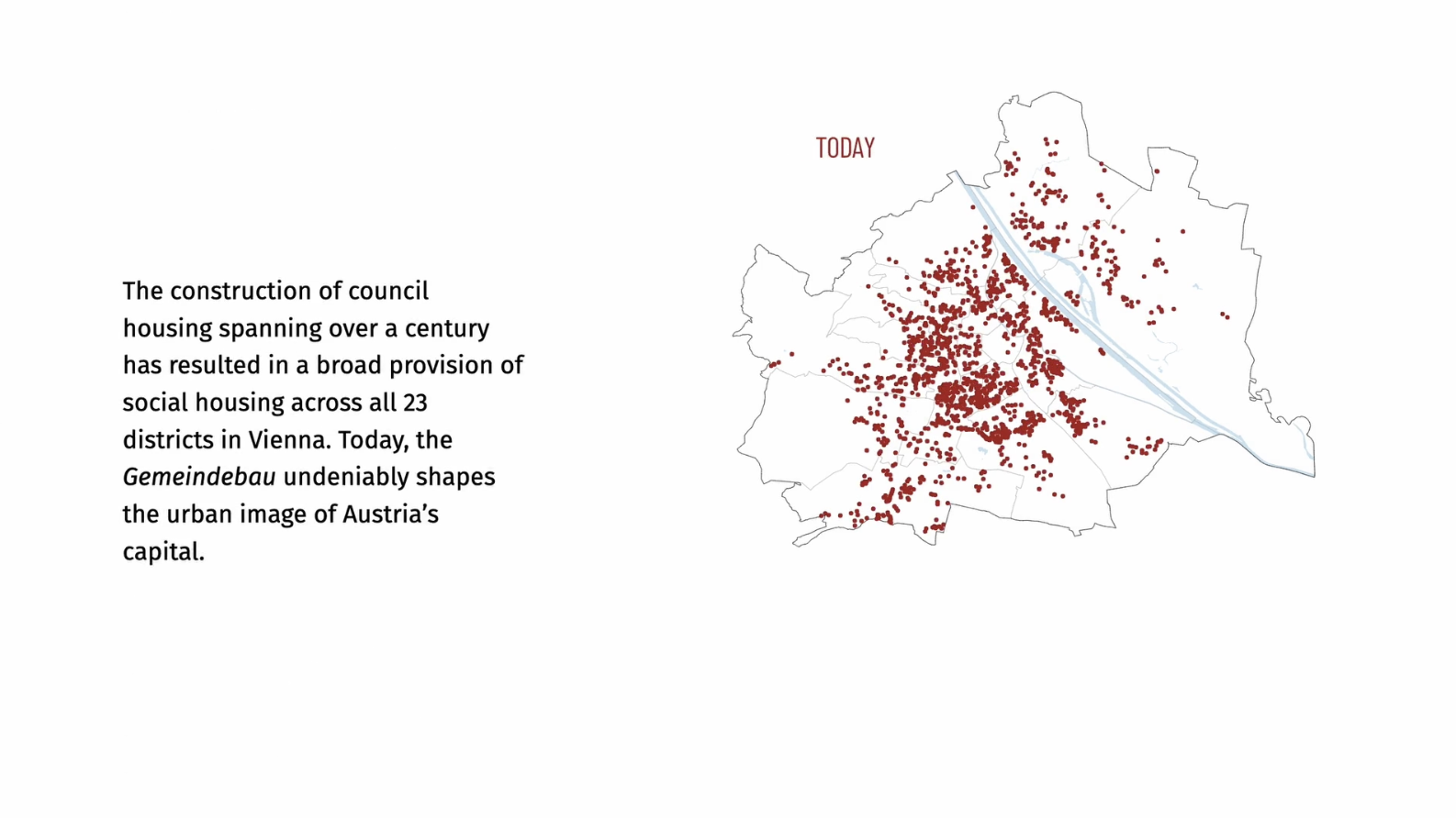
Council Housing & Neighborhood Income Inequality in Vienna
Best use of scrolly storytelling
Article | Repo | Submission
Andrew says: “This entry perfectly demonstrates one of my favorite use-cases for Closeread: authoring an engaging story to highlight the key ideas of a technical manuscript. The evolving map of housing in Vienna over time is beautiful and effective. The graphics and tables are all very polished and the layout is as professional as any you find on the web.”
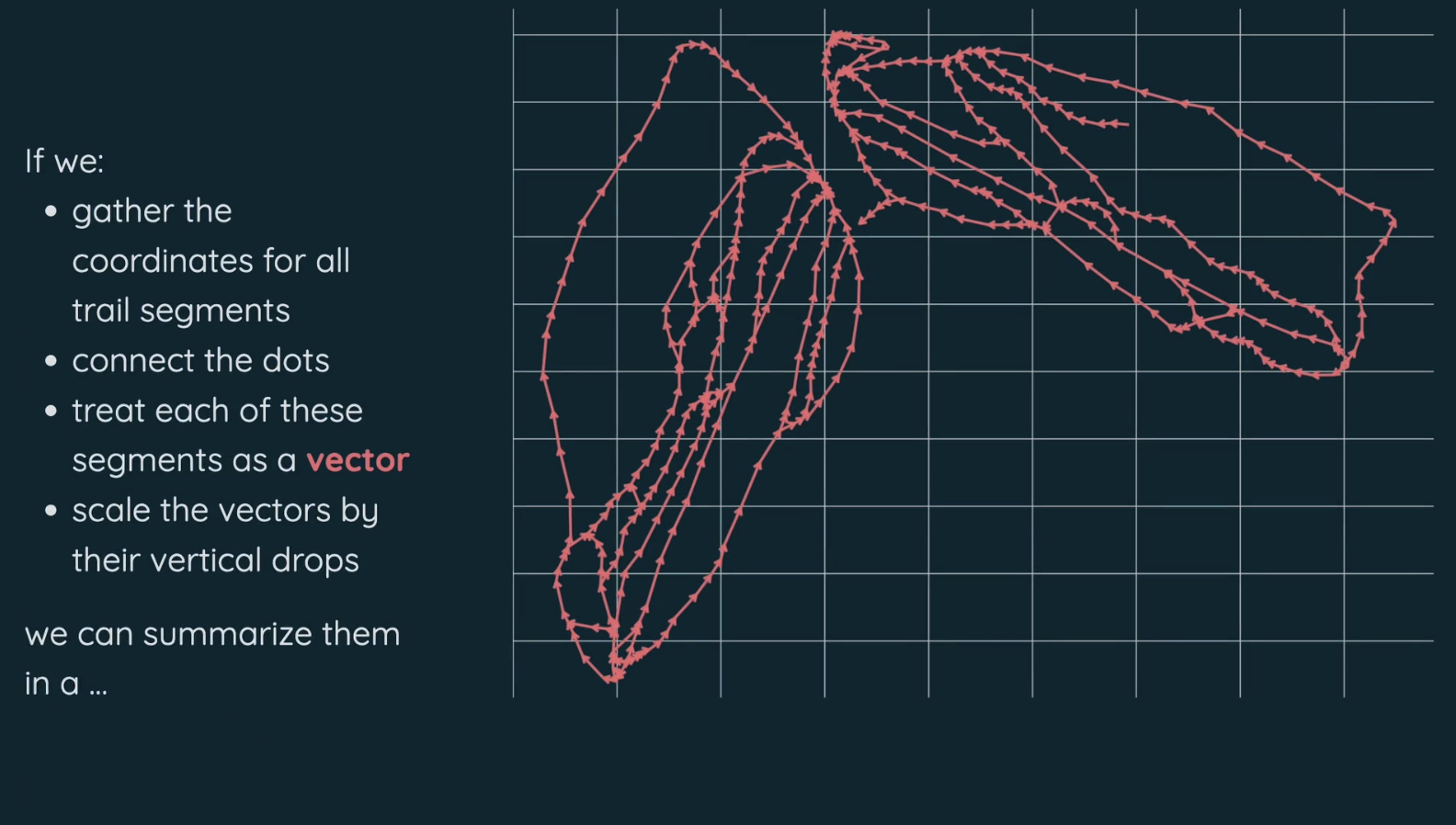
Which Way Do You Ski?
Best technical accomplishment
Article | Repo | Submission
James says: “This story carefully designs successive plots to seamlessly summarise snowfields. Thoughtful visuals and language make this story the complete package!”
Andrew says: “This is an excellent story on all counts but two things stood out to me. 1) the “ski-rose” is an example of a complex visualization that is so well-served by scrollytelling. 2) this scrolly at openskistats.org sits alongside a technical manuscript and beautiful interactive data table, showing how different formats can serve complementary roles in communicating insights about data.”
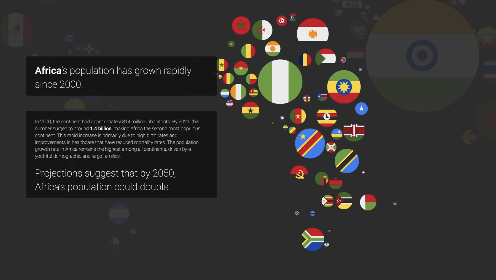
World Population Flags
Best visual polish
Article | Repo | Submission
James says: “This story cleverly embeds Observable notebooks to fade out different flags of the world as it zooms around. The text has a strong visual hierarchy and structure, making it extremely readable.”
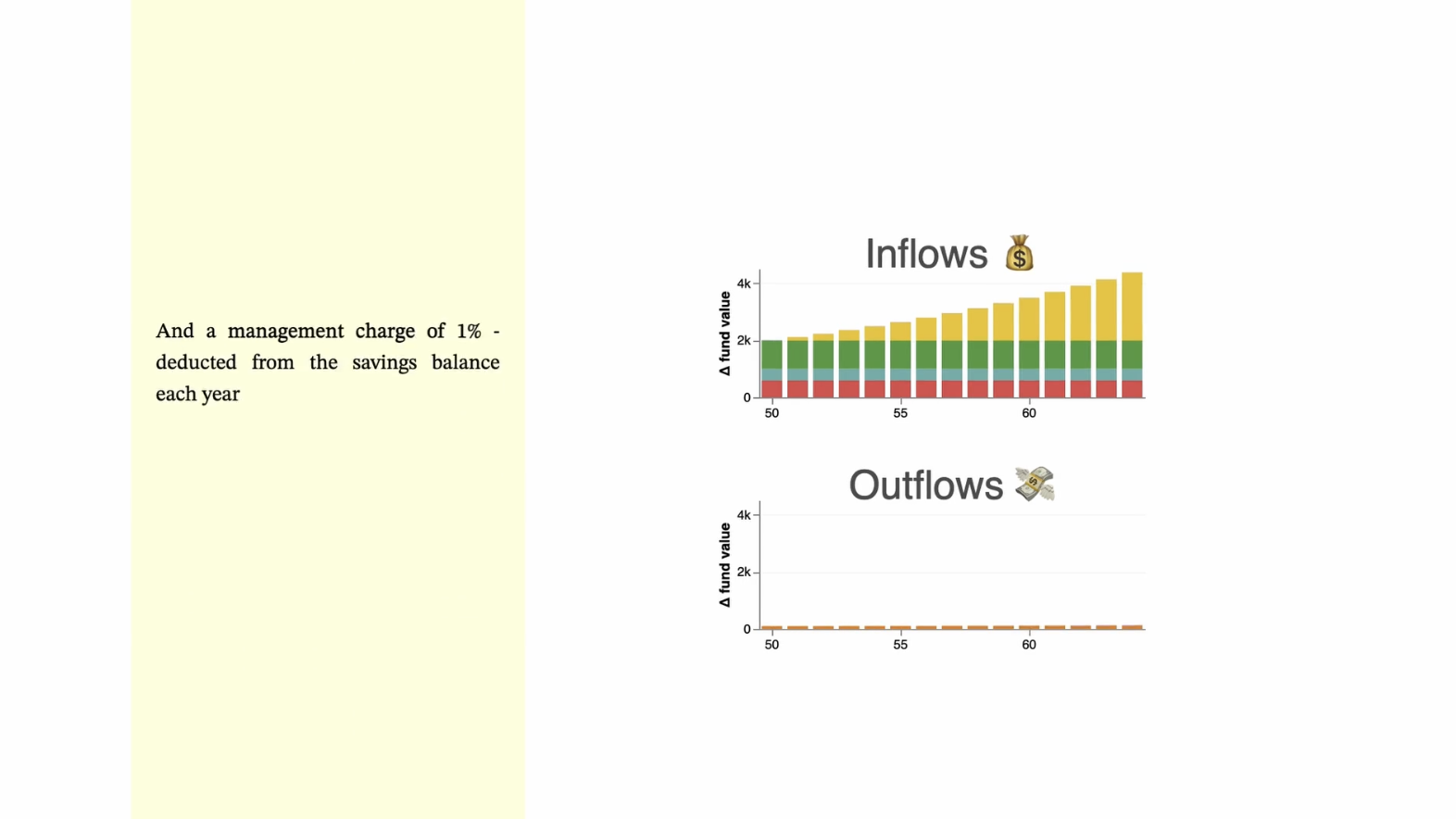
Pictures of Pensions
Best Link Between Scroll and Dynamic Data Visualization
Article | Repo | Submission
Curtis says: “This piece is impressive, demonstrating how effectively scrollytelling can be used in data-driven articles. It synchronizes OJS data visualizations with scroll progress, so as the reader moves down the page and the narrative unfolds, the visualizations change, smoothly transitioning in support of the narrative. I hope those exploring Closeread recognize the wide potential being showcased here!”
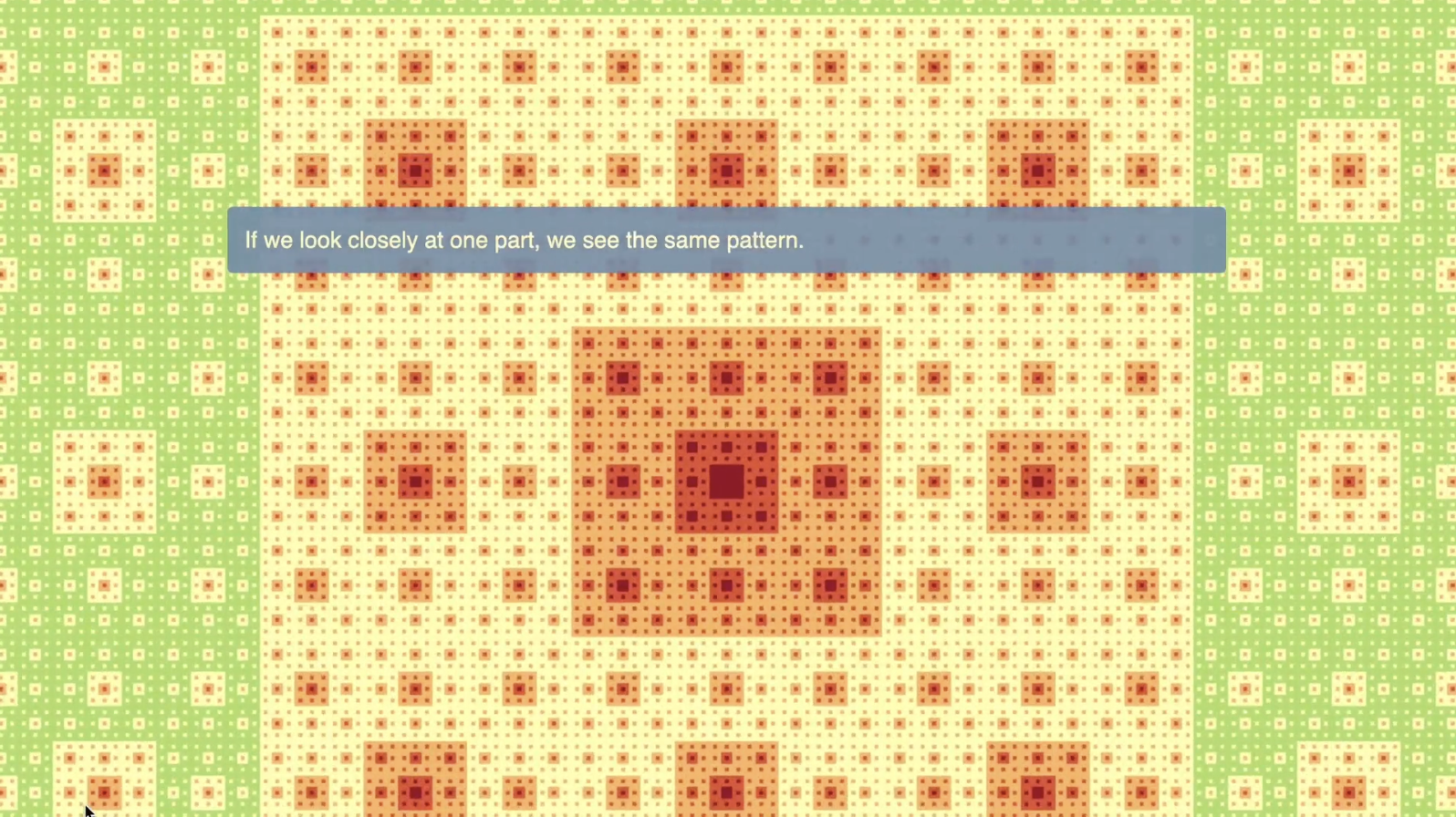
Beyond the Modifiable Areal Unit Problem!
Best Zoom
Article | Repo | Submission
Andrew says: “There are few more natural fits for the scrollytelling zoom than the study of fractals. This entry breaks down a complex topic in mathematics and geography using carefully crafted examples that are mathematical and diagrammatic. The final zoom into Paris, showing the changing variability of density, is glorious.”
A Gem of My Childhood
Best Map Pan & Zoom
Article | Repo | Submission
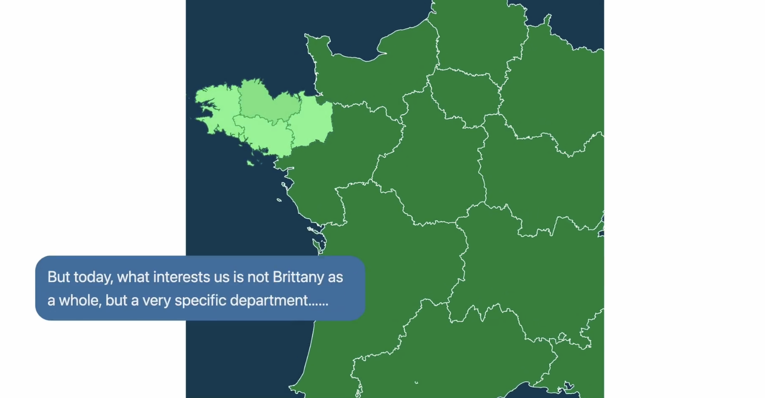
Curtis says: “Scrollytelling, when done well, turns reading into an immersive experience. As you scroll, visual elements unfold dynamically, drawing you deeper into the story. When poorly executed, scrollytelling elements can feel gimmicky or distracting, a well-crafted piece enhances storytelling, sets the topic or location, or reinforces key points in an engaging way. A Gem of My Childhood is a lovely example of the promise of scrollytelling with Closeread—it opens with a wide map of France, then zooms into Brittany and the Saint-Jacut-de-la-Mer peninsula as the reader scrolls. Talk about setting the scene and pulling the reader into your story!”
No matching items
Honourable Mentions
No matching items